
As Minneapolis experienced its coldest Thanksgiving in 20 years; -2 degrees Fahrenheit, I found a moment to examine cold winter mornings. Here were brittle skeletal stalks of cattails and blue violet shadows on snow. Earlier artists from Holland’s 1600s described their winter with frozen canals and harbors laced with skaters. Later 19th century Impressionists found winter stimulated them to explore complementary color relationships like violet vs. yellow and, blue vs. yellow and peach. Winter became the time for nuanced tones of pale grays and violets, the time to build cold luminosities.
At the end of the 19th century Winslow Homer dramatically simplified his compositions. The snow blankets of winter helped this process as you see in example 1. A few years later in 1908, the early expressionist pioneer, Marsden Hartley was separating himself from Impressionism (See example 2). Unlike Monet’s Impressionist winters, Hartley finds simple shapes and reduces them to iconic status. He applies paint like a winter Impressionist but, we see his later bold expressionism bubbling up. By winter 1982 Neil Welliver usurped the broken forms of Impressionists, suppressed their complementary color palettes and reintroduced edges to forms but, kept the Impressionist appetite for confusion (visual noise through a texture of small overlapping strokes) as generator for emotional sensation (example 3).
example 1. Winslow Homer

example 2. Marsden Hartley

example 3. Neil Welliver

If I borrow Hartley’s palette and the vertical composition of Welliver I discover winter in Manhattan (example 4). My buildings and figures take over the vertical role of Welliver’s trees. If I transfer the vertical confusion set up by Neil Welliver to a winter marshland of cattails I get examples 6 through 11. Here are step-by-step developments of two different paintings sharing the same source material (photos in example 5). They are reconfigured into squares. In the first step-by-step sequence (examples 6 through 9) I begin with brushed-silver anodized aluminum.
example 4. Winter in Manhattan, oil.

example 5. some of the original photos.

The next images are the same size as Neil Welliver’s study, 18×18. Step 1 (example 6) covers the surface with an unevenly blended combination of red iron oxide and ultramarine blue. Step 2 (example 7) With soft synthetic flat brushes I reveal threads of the silver substrate which is now stained by the red iron oxide to look golden. In step 3 (example 8) I added opaque pastel colors to both sky and foreground. I smeared the foreground with gentle vertical strokes. The blurring at the lower part of the picture (ground plane) evolves into more clarity in the middle ground. This blurring from the edges into clarity toward the middle imitates our own act of vision. The center of our vision enjoys much more clarity than the periphery.
example 6. step 1.
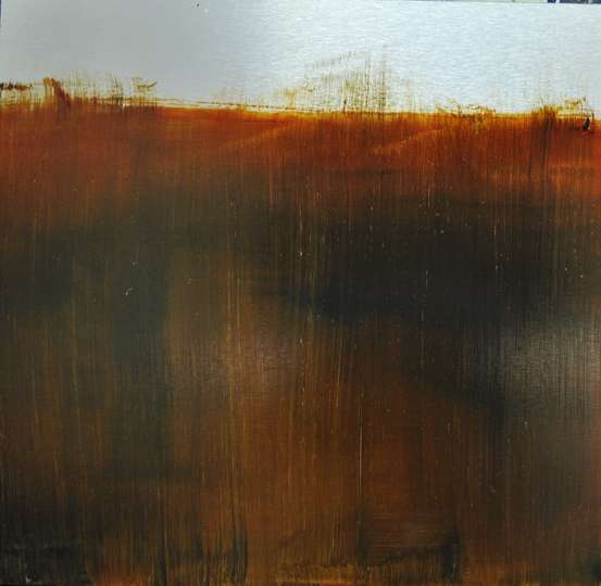
example 7.step 2.
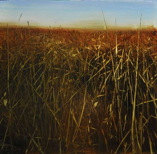
example 8.step 3.

In steps 9 through 11 I pursued a slightly more abstract effect. I start with an underpainting of varied yellows in acrylic. Step 1 (example 9) shows my initial lay-in with ultramarine blue and red iron oxide. The sky reveals the color and quality of the underpainting which I will later rediscover with a squeegee strokes. Step 2 (example 10) shows the evidence of my squeegee work and gentle over-scrubbing with synthetic flats. Step 3 ( example 11) presents the image after adding opaque pastel blue which gets dragged and blurred up into the darker middle area. Finally, I return with the squeegee to find brighter and cleaner threads of the yellow underpainting.
example 9. step 1.

example 10. step 2.
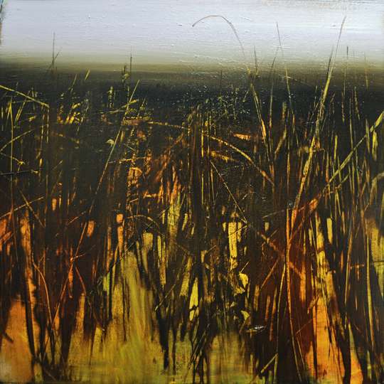
example 11. step 3.

I conclude this exploration on with an earlier collaborative painting ( an oil on raw aluminum,48×48) by Max Dunlop and Me. The image begins with a wintry vista in the Badlands of the Dakotas (example 12). We borrow ideas from older winter Chinese paintings reaching as far back as the Sung Dynasty in the 12th century.
example 12. Badlands in Winter.

maggie ryan
every stage just looks wonderful, example 6 step 1 , beautiful, so was example 9 step 1…. though wondering why you did the yellow sky in acrylic and it was never seen? the painting changed direction? anyway love reading your blog… thanks david…
Fredric Neuwirth
Winslow Homer’s Sleigh Ride is at the Clark. A small wonderful painting w/ great triangles & diagonals and great use of dramatic color
I like your collaborative painting w/ Max. It looks cold. Great texture
Katie piazza
Cottontails texture is astonishing the glow through the weeds miss seeing your work!!!
Patricia Scanlan
Terrific blog for winter. These examples were amazing in person.
Thank you for putting these together for the class. The year was so great, I will certainly miss your guidance, examples and demonstrations. Thank you.