
Color suggests emotional temperature which helps arrest attention. Reversed expectations also arrests attention. It works in literature, stand-up comedy, music and painting. Presenting a surprising aspect of a well-known subject makes the viewer reconsider their understanding of reality. Surprise is the ultimate contrast. It can expand the definition of a genre or subject. Monet exploited color’s ability to surprise in his soft violet and blue summer-morning paintings on the Seine. He used a cool palette to describe a warm season just as he would later paint winter haystack as they revealed the warmth of sunlight on the haystacks surrounded by blue snow shadows. The blue boosted the power of orange and vice versa. I borrowed Monet’s idea of a cool violet, blue and yellow green palette for a summer morning pond to render a cool temperature (example 2). In a reversal, I use bright yellows to dominate a winter estuary scene (example 3). Where Monet used broken edges for a vibrating color I let the colors spill outside the edges of their respective objects whether it’s the water, the marsh grass or the water areas.
example 1. Monet Haystacks 
example 2. My Cool Summer Pond 
example 3. Bright Warm Winter Estuary with loose color borders. 
Next, I begin with another later summer blue tide-pool painting as a substrate for a winter stream. I found its arrangement of a small area of warmth at the top and a darker lower area coincidentally useful for my winter stream painting. Example 4 presents the stream in its photo form after I exaggerated the colors in Photoshop. Example 5 shows the original tide-pool painting. Example 6 shows me initially covering the dark blue with an oily layer of lighter blue. I make the paint oily in order to easily manipulate the paint later with a small squeegee. The wetter the paint the easier it is to manipulate with a squeegee. If I were to use stiffer paint then, it would be easier to manipulate with palette knife or to suggest various textures with a brush. Example 7 shows the image after deleting paint with a squeegee and softly texturing with a flat synthetic wash-brush. Example 8 presents an image with a bright warm background contrasting with the dark foreground. Observe the meandering dark serpentine triangle (the stream) which creates depth in the painting. In example 9 I have a winter painting with a similar warmly colored background but, the foreground uses a light meandering triangle ( the drive ). The trees were created with squeegees. The drive and snow were created with brush strokes.
example 4. photo for winter stream 
example 5. original tide-pool painting to be over-painted.
example 6. Step one, covering the tide-pool 
example 7. Step two, after initial squeegee deletions 
example 8. Step three with warm forest 
example 9. Bright triangle drive in Snow. 
In this next winter scene I use deep reds, pinks and coral colors for a winter marsh scene. I begin with a photo whose colors I amplified in Photoshop ( example 10). Next, I begin on white oil enamel anodized aluminum (24×24) as my substrate. I do not use squeegees in this painting, only brushes. My first brush is an 8″ flat which covers a third of the painting surface in a single stroke. I orient the strokes vertically where I intend to suggest a vertical tangle of weeds, reeds and branches. I orient my strokes horizontally with a smaller 3″ flat to suggest the distance in a band of blue (example 11). Example 12 offers a view of the painting in mid-development. At this stage I complete the design and make certain of its simplicity, its progression from a wide dark horizontal band to its next thinner light horizontal band (reflecting water) to the next dark band of reedy area to the next thinner band of coral light (the top of the meadow) to the darker blue (also complementary to the coral color) distance. Example 13 presents the painting after piercing the dark forward area with small lights, and an overall development of more texture variety.
example 10. photo of winter marsh 
example 11. Initial laying in of paint with the 8″ flat 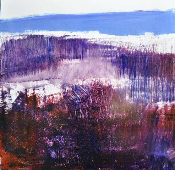
example 12. Next step 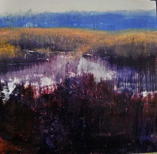
example 13. Last step to date. 
Gail Ingis
Great examples David. It’s a visual feast. Thank you.
ingrid
This post is awesome. I love it the most of all the recent ones.
admin
This is wonderful, David – the process of all of the paintings is riveting. I have to remember to just take chances. xox, Connie
loretta sharpe
That snow scene……..I can feel the snow crunching under my feet, see my breath and think powder.
Fredric Neuwirth
It is fortunate that some of your paintings are adaptable for re-use creating a winter stream from a tide pool. In example #12 I particularly like the reflections. In example #13 the piercing of then foreground is very effective and expands the space but you eliminated the wonderful reflections ( I think ) that you had in example # 12.
William Child
I am with Gail’s comment, “A visual feast”, and Ingrid’s comment as well, “This post is awesome.” I love how you paint water with depth and surface working together like Examples #5 and #8.
Example #13 is amazing! I can’t fathom what you would want to do with it next?