
Prior to the 19th century artists using windy imagery looked to seascapes and sailing themes. Early in the 19th century to landscape artists, John Constable and J.M.W. Turner looked to skies to generate a feeling of windy motion in their pictures. Seascapes aside, by the 1860s American Artists like Winslow Homer tried animating their paintings with breezes amidst meadows. Look at his “Veteran in a Field” from 1865 (example 1). The wheat bends left from the wind while the scythe is held incounterpoint. The cut wheat shafts lie in a receding “v” pattern at the Veteran’s feet. The design vectors act in counter point to balance the image.
Example 1. Homer’s “Veteran in the Field.”

Homer also tried investing motion in his landscapes through experiments with his small watercolors and oil studies. For example, two years later in 1867 he makes this small oil sketch (example 2). The horizon is canted to give a sense of movement. Unfortunately, every other layer was similarly canted with the wheat gatherer as the only counterpoint exception. This surfeit of regularity would be corrected later in other studies or an exhibition pieces. I later reprised Homer’s idea of canting the horizon but also created a series leveling zig-zag shapes below to avoid Homer’s problem of repeated suspicious regularly angled shapes (example 6) . My rhythmically undulating field grasses suggest the evidence of a subtle breeze and, offer more variety of counterpointing shapes than the Homer 9”x12” impromptu oil sketch.
Example 2. Homer oil study.

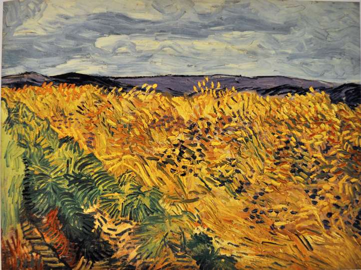
I found other precedents than Homer as a model for moving patterns of meadow grass. Vincent Van Gogh was driven to give his images rhythmic, moving imagery. In one of his last paintings from 1890 (example 3) we see how he orchestrates the rolling movement of the grasses into a singular concert. These shapes are set against the slow horizontal movement of the horizon and the horizontally composed cloud forms.
Example 3. Van Gogh fields.
The following steps demonstrate my borrowing from the models of Homer and Van Gogh. First, I shot a series of photos from a low (lower than kneeling) point of view (example 4). This image served as my springboard. Painting’s first step can be seen in example 5. Here, I just laid in broad areas of color with special attention to the value of the colors and their placement in the design, a design dependent upon the slightly canted meadow as seen in Homer’s example 2. The next step (example 6 ) presents the image in its current form with patterns of grasses swaying in rhythmic counterpoint.
Example 4. Photo used as point of departure.

Example 5. First step in the painting, color fields.

Example 6. Current state of image with rhythmic grasses.

In this blog post’s title I promised painting with cloisonné effects. Previously I tried a similar effect but, now I decided to use copper as my substrate. Copper has long been used in cloisonné especially because its orange-ish tones complement the lapis lazuli (ultramarine blue) used in the dark interstitial spaces. Further lapis lazuli effects must wait for the current painting to dry to be most effectively applied. I wanted you to see the progress of this painting to point.
Example 7 (step 1) presents the initial laying in of colors still revealing much of the raw copper in the upper right. Example 8 (step 2) demonstrates the first of the linear reveals (deletions of paint to reveal the copper below). Example 9 presents the image in its current form.EF
Example 7. Step one,

Example 8. Step two.

Example 9. Step three, image in its current form awaiting further development.

Let me again invite you to visit an exhibit of my works at the Susan Powell gallery in Madison, Ct. The show will be up through June 18th. Contact the gallery at susanpowell fineart.com or call 203 318 0616. The gallery is open Tuesdays through Saturdays 11 to 5.
I also invite you to join me in late June (20-24th) painting in beautiful Sun Valley, Idaho for a 5 day workshop (watercolor, acrylic, oil and mixed media). Contact the Sun Valley Center for the arts (ask for Sarah Kolash) at skolash@sunvalley.org or call 208 726 9491 ext 121.
Gail Ingis
David, great blog, as usual. The processes you use along with the painting examples of the masters are productive learning tools. Thank you.
Raquel Green
David,
Love to see your work and grateful to have the opportunity to share your work.
When are you coming to Florida?
Thank you .
David
I am planning to do a workshop in Jacksonville in April 2017. Thank you for your inquiry
Fredric Neuwirth
“Veteran in the Field” the sky is placid but the strongest element is the powerful “V” that forces you into the painting. The oil study needs an opposing force against the up hill direction.
Step #9 what seam disconcerting is the shape of the sky. The sky in the photo #4 is quite beautiful and very dramatic. It is a lot better than van Gogh’s.
Shirley Ploog
David, I love the information you provide, so good and a big fan of Van Gogh and his use of paint and paint strikes create movement and energy.
Linda Boisvert DeStefanis
I always enjoy seeing your paintings of ‘grasses’ and how you make them beautiful! My friends and I plan to see your show at Susan Powell. I have told many people that to see your paintings in person is Amazing compared to seeing them online. Inspirational how you are always experimenting and enjoying painting!
Therese
Thank you David for this educational and informative blog post. I really enjoy your videos also.