
Art history has seen waves, ships, maidens, sailors and plastic water-bottles thrown, shattered and strewn against the rocks. These painted collisions have been harsh and theatrical or, soft and subtle, detailed and legible or, blurred and abstracted. Painting the tension between land and sea, between dynamic waves and unmoving rock has a history that crosses time and continents. My eye has been distracted by the collision of sunlight against rocks. If mystery lives in shadows then the longer the shadows the deeper the mystery. Late and early sunlight shows us elastic shapes with stretching shadows. The elongated shadows describe the surface of sea and land, cross it with attenuated patterns and serve up opportunities for new compositions and vivid color harmonies.
If I look to the first half of the 20th century I find the shoreline experiments of artists like Rockwell Kent and Edward Hopper as they distilled and abstracted their experience of sunlight on the rocks. Their ideas of complementary color harmony can be seen in Hopper’s rock sketch on the coast of Maine (example 1). He shows us how to use value, design and color to highlight and separate the planes of rocks. Rockwell Kent’s painting presents a silent horizon and a quieting sea that earlier cast a ship onto rocks (example2). He relies on the chromatic complements of ultramarine blue and yellow to give a morning’s glow to his work. The rocks are choreographed into a stylized set of shapes, pillowy squares and triangles pinning the arc of the boat against the sea.
example 1. Hopper 
example 2. Kent. 
I found myself along Connecticut’s sunset shores. Those lengthening shadows with red, orange and blue caught my attention. First, I looked to find a less clichéd pointed of view. I tried lowering my camera down to the surface of the rocks. This telescoped the distance between proximate rocks and distant ones. They dramatically overlapped one another to indicate who was in front and who was behind. I brought my photos to my computer where I stretched the shadows further, elongating the rocks as well. I pushed the contrast higher. I brought my new computer-photo ideas to my easel. Here, I exaggerate color, texture and shape still further.
I blurred images and heightened color contrast at the computer. I continued this process at my easel. Example 3 presents an earlier stage. Example 4 presents the same image after heightening color contrast, value contrast, blurring, and adding more geometric distortion and ambiguity.
example 3. step 1 
example 4. step 2.
At the computer I compressed a photo’s imagery to fit within a square format ( example 5). I then reversed that image and overlaid it with another blurry stretched version of itself (example 6). The painting evolved through stages of abstraction until I came to example 7. I noticed problems. The lower right needed to better advance to the viewer. The bottom edge had too much similarity in the size of its shapes. The division of space in the lower right quadrant was too regular. I had more work to do. The result of the modifications can be seen in example 8.
example 5. square compressed photo.
example 6. overlaid with blur and reversed.
example 7. step one of the painting.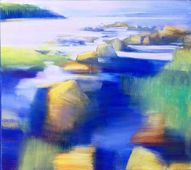
example 8. step two of the painting.
I again compressed a photo to fit within a square format (example 9). In example 10 I overlaid the previous photo with a blurred version of itself and, I pushed the color in new directions. At the easel I stretched the rocks further. I introduced blue-violet vs. amber color harmonies as well as placed patches of deep carmine in the shadows of dark green areas. The water’s surface became light violet-pink against dark green shorelines. Here was another use of simultaneous contrast relying on both value contrast and color contrast. I sharpened select edges to snap some shapes out of the blurring background.
example 9. photo squeezed into a square.
example 10.same photo layered with a blur and re-colored.
example.11.painting on canvas.
Sylvia Keller
Example 8, step 2 of the painting: I liked this example best. Was this the final version and painted on Aluminum sheet?
David Dunlop
Sylvia,
Yes, example 8 was the final version so far ( it’s presently in an exhibition) and, it was painted on white anodized aluminum (Omega Bond or Di Bond).
Elaine
The paintings are all so beautiful. Love the Hopper and all the transitions. Brilliant! Miss you!
Fredric Neuwirth
There are two paintings; example #8 & #11 of a rock water subject. Am I right? It would be great to see the result of the process. What is interesting is the color selection: blue amber harmonies, patches of deep carmine, violet pink water. It feels expressive!
Jennifer Richard-Morrow
Can’t wait for the workshop in two weeks!
William Child
I thought it interesting that in your example 5, in the small image, I saw two or three women, one in a dark skirt in the foreground and and several others further in the distance. Maybe it’s the heat?
David Dunlop
HI,
Yes, I think with all the blurred imagery the painting is fertile territory for projecting (hypothesizing) varieties of figures. We see faces, figures and animals in suggestive pattern fields (and in that order of liklihood). Thanks. David
Betsy Duncan
This really reinforces all of the info you gave us at Nicole’s workshop. Love all the color harmonies.