
A bath of light can create the same veil of ambiguity and mystery as a bath of darkness. Darkness presents a bluer mood like hearing a song a in a minor key. An abundance of light gives the upbeat feeling of a song in a major key. And, a varnished surface reflects less glare over light than dark.
J.M.W. Turner turns the chiaroscuro tradition of sparkles of light popping through darkness upside down. He takes Rembrandt and Caravaggio’s unifying darkness and substitutes light. This revolutionary substitution does not happen at once. Turner develops his bath of light slowly through experiments in watercolor which are transferred to his oils. His revolution extends to our tastes in art today. Monet will adopt the his program of light dominating darkness.
Turner discovered that light offers the same obscuring and suggestive mystery as darkness with the advantage of more luminosity, a luminosity that resembles daylight, that evokes the yellow light of the sun. Look at a mid 1830s oil of Turner’s (example 1) then compare it to earlier dark chiaroscuro artists whom he admired like Rubens (example 2) and J.Van Ruisdael ( example 3). Observe how Van Ruisdael simplifies the Ruben’s composition by substituting clouds for trees and flora. Notice that Turner borrows Van Ruisdael’s compositional forms in his seascape. Turner uses freer gestures and reverses ratio of dark to light areas.
example 1. J.M.W. Turner seascape 1835-40.

example 2. Rubens landscape.

example 3. J. Van Ruisdael landscape.

Turner lets the light blur the edges of his shapes just as Rembrandt let darkness blur his edges. This blurring creates a greater sense of motion and space.
Consider my next photo of a woodland and pond (examples 4 and 5). In example 4 I cropped the image to show more dark than light. I cropped example 5 to present more light than dark. The mood changes with the ratio change in dark to light areas.
The level of contrast is low which gives a pale effect in example 6, an interior of Grand Central Terminal. Look at the same image after an application of darkening glazes ( example 7). The apparent contrast is increased not only because of the application of darker glazes but also because, example 7 has smaller areas of light in relationship to its areas of dark. The mood moves with the darkness.
example 4. woodland photo with more dark.
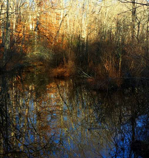
example 5. same photo with more light and lower horizon.

example 6. Grand Central Terminal with less contrast and lighter palette.

example 7. the same image after darkening glazes.

Following the new tradition of Turner, I employ a bath of light in Grand Central Station which results in example 8. Or, I can put a veil of Turner’s yellow light over woodland landscape as in example 9. Example 10’s subject, winter mist, invites further applications of pale obscuring light.
example 8. Light and Luminosity in Grand Central.

example 9. Yellow and Violet Glen, oil.

example 10. Winter Mist, oil on anodized aluminum.

Use a pre-existing dark surface as another strategy for applying the bath of light. Example 11 serves as the dark under-painting for example 12. It is an on copper which I over-painted with lighter colors (pale violet and pastel yellow-oranges) then, I cut away slivers of dangling dark shapes. These shapes are scattered like hanging, dark, calligraphic pictographs. They oscillate between being leaves or feathers or, the suggestion of windblown shamanist prayer flags. I also liked the association with American Indian lore.
example 11. original underpainting, oil on copper.

example 12. Repurposed example 11 as a Winter Meadow.

On January 31, 2015 Max Dunlop and I will have an exhibition of our collaborative paintings at the Watershed Gallery in Ridgefield, Ct. At this moment Max and his wife, Natalie, are hiking along the Strait of Magellan to the southernmost outpost in South America.
Barbara Tuzzeo
I am still trying to find where I can purchase anodized aluminum or copper sheets to use for these processes. Also what type of glazes are you using. Please send me this information.
Barbara
Gail Ingis
David, thanks for the dark and light comparisons. Love the darks in those past centuries paintings, love your light in this present century paintings. Fun to see them evolve. The glazing process is amazing.
John Vukelic
Can darkness denote joy and happiness and lightness sadness and heart ache? Heck, if they flipped it one way lets flip it the other. Enjoyed your analysis and really enjoyed seeing your application of it.
Alice Jackson
This is a very enlightening posting. It will guide my illustrations for a children’s book that moves from the dark of night into the morning sun. I miss the opportunity to take your classes at Silvermine.
Fredric Neuwirth
Good blog! Turner’s light is the seducer. Example #5 glows and the space enlarges while in #4 it is more constricted but the water is magnificent. I would like to see #5 with #4 water. Is that possible?
So pleased to be back in class; I really did miss it.