
What do we find appetizing? Alluring? What makes the pastry shop window, the candy store display, and the carnival attractive to us? Simultaneous contrast. The strategic use of complementary colors often in tint form ( that is the sensation of white in a color) is the key to popular seduction. Complementary colors juxtaposed mutually amplify one another, especially where their edges meet. From Edo Japan to Impressionist France , the artists’ recipe called for complementary colors. The French chemist/scientist Michel Chevreul had discovered the secret of the candy store; we like complementary color relationships. We find them tasty. Their contrasting colors give an impression of vibrant unity. As if everything is related. As you see in example 1, a watercolor by Turner of a Venetian interior, Turner discovered he could create a condition of brilliant light, even glaring light with dynamic colored shadows by using complementary colors.
example 1. 
To create a neutral, warm color Turner mixed a thin solution of two opposites(color complements), red-brown and blue. They appear warm next to the blue patch of wall. The yellow form flies toward the viewer propelled by its contrast against blue. Yellow and blue create a powerful chromatic contrast . The red/brown settles itself in the foreground by virtue of its contrast to the blue patches above and, because it is darker. Warm darks suggest proximity and gravity. The light out the window is an applied opaque white which makes the interior feel as though it is comparatively dimmer.
example 2.
While Turner painted his watercolor, Hokusai was making colored woodblock prints in Japan (example2). This image, a “Southern Wind around Mt. Fuji”, exploits the complementary contrast between blue and orange. The blue sky rides behind the red-orange-brown of Mt. Fuji just as the contrasting green trees sit in front of Fuji. Each complement pushes and pulls the location of its neighboring area.
Example 3 .
Here in example 3 Cezanne uses the same root complements, red-orange, blue, and green. The green and the red push against each other just as the reddish color pushes against the blue of the sky or, blue on the shadowed walls. Cezanne added white and diluted the chromatic intensity of the colors to create a quieter contrast and, a more unified tone to the painting.
I borrowed from these masters as you can see In my painting in example 4( Water, Leaves and Reflections). I used the red vs. green complementary harmony. The red areas often blurring their edges with the green areas, a device which keeps the various elements feeling interconnected and occupying the same spatial plane. The influence of Japanese flat leaf patterns and flattened shapes as well as Hokusai’s palette is noticeable here.
example 4.
I borrowed the blue vs. orange complementary harmonizing contrast in my 5th example. Notice that most of the color contrast moves toward the viewer(bottom half of picture) and, the contrast diminishes into a paler, grayer atmosphere toward the top, especially the top left. Like Cezanne, I left parts of the light areas unpainted to let them appear more reflective and luminous. Also like Cezanne, I made complementary tints; that is I added white to the color to sweeten it, an ironic twist to an aerial depiction of LaGuardia Airport in NYC.
example 5.
Example 6 is a photographic illustration using chromatic harmonies through chromatic opposites as you can see in the strong yellows versus the surrounding blues. Blue vs. yellow and orange-red creates a lively pattern of contrast. I pushed the color contrast in Photoshop . The image became more arresting and more unified the more I pushed the complementary contrast. Before leaving this subject let me invite anyone interested in classes with me at the Silvermine Art Center in New Canaan, Ct. to register now for either of my landscape painting classes on Tuesdays or my experimental painting class on Wednesdays. Go to Silvermineart.org or call 203 966 6668
example 6. 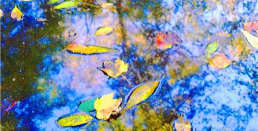
Kay Halcrow
Elucidates, literally, what and why color complements work!
Gayle Piersol
Very helpful, David. I will keep these ideas in mind as I compose my oil painting for the Friends of Greenwich Point coffee table book. So many fond memories of the trips with you and your wife in Italy and France!
Jerry P
Excellent clarification of a means to attain unity. Enjoyed Lakeville and the Ocean House and look forward your class this fall.