
How Does Gerhard Richter make an abstraction cohere into a seeming unitary bundle with 3d illusion? How did past masters manufacture coherence and harmony in their work? What are the tools? What are the methods? How can we manipulate our perception into building splats of paint into cohesive illusions? We know that overlapping forms deliver a message of layered space. We know that proportionately diminishing objects of the same measurable size indicate space, space conceived with linear perspective. We know that perpendicular intersecting shapes suggest tension and are a contrivance which captures our attention. We know the unifying effects of basic shapes like circles, triangles, spirals, and even serpentine shapes. We know we have a penchant to see dissolved edges of shapes as indication of 3d volume. We know that areas of vague or uncertain specificity will trigger our impulse to see nameable shapes and digestible narratives. We know we will make guesses about vague imagery based on our stored memories and preliminary mental priming. (Talk about ducks and you are more likely to see them in clouds or embers of a fire. Preliminary mental priming accounts for much of the visual imagery even in our dreams). Because we know these things we can be better painters. Gerhard Richter executes an abstraction with apparent unified space because of the locus of overlapping and contradictory shapes in this painting example.
example 1, the painting.

example 2, a detail from the painting.

In Edward Steichen’s painting his harmony of touch( notice the brush touches share a limited style and sizing), his harmony of color and value ( he uses analogous colors with close values), his design (an elastic circular design which surrounds the painting’s deep space with the use of framing shapes on the side, top and bottom) generate coherence. The familiarity of his design (borrowed from Claude Lorraine) puts us at ease and makes it easier to project an illusion of space because we have earlier repeatedly encountered this form ( that’s our stored memory).
example 2, Steichen
example 3, Claude 
Neil Welliver, a modern landscape painter, creates his harmony through the repeated manner of his brush strokes, the uniformity of his edges ( uniformly hard-edged defined shapes), his limited palette, overlapping forms, linear perspective recession, and the suggestion of a mirrored surface (water) through the use of repeated reciprocal forms with less saturated color.
example 4, Welliver 
In the next example, a photo with a superimposed diagram in pink. The photo shows us leaves of easy legibility in the foreground but, diminishing legibility and size as they recede into space. The leaves are grouped into a serpentine shape (see pink line wending back into the picture). This grouping of the form as it winds its way into deeper picture space glues many leaves into a unitary shape. Although, there are outlying leaf shapes they appear as cast offs from the cohering serpentine form. We always automatically group similar things together and create a unity. It’s how Linneaus in 1735 created our system for the taxonomy of plants and animals; Kingdom, Genus, Species .
example, 5 photo. 
Wayne Thiebaud toyed with the painter’s tools for unifying
an image with perspectival space. He applied different instances of linear perspective on different areas of the painting surface ( picture plane). He unified these disparate examples into a single image through harmony of color and tone. He also used a single continuous undulating vertical shape and, often a unifying linear perspective pattern. He used the standard introductory device of a triangle pointing into the picture( at the bottom or, start of the picture). He further created the illusion of a flat, mapped, picture plane through the use of reflection( see reflecting central stand of trees, a reference back to Claude Lorraine).
example 6 of Theibaud with pink perspective diagram lines. 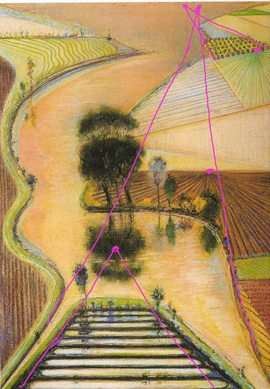
Next is an example of a flawed painting of mine which needs more unification. In the first stage the cylinder ( the kiosk in Grand Central Station which reminded me of a carousel) is too pronounced and overwhelms the image. It breaks harmony with the rest of the painting. It needs reintegration and harmonization. The entire painting is too spotty and lacks a singular thematic motion.
example 7 , first stage 
example 8 second stage 
Now, the image reads from a darkened bottom (threshold) and moves up toward light. The scale of the kiosk/carousel is reduced and subsumed into the painting. The edges of the figures are more dissolved and blended which heightens the unity of the painting and encourages more guessing on the part of the viewer. Implicit coherence is increased ( see Daniel Kahnemann , Think Fast Think Slow.)
In the last two examples I have one which is a traditional landscape of mine. The color, the palette, helps unify the painting as does the ambiguity of the dark foreground . This darkened territory allows for more guessing about its contents. We move back toward the light using some linear perspective ( buildings and trees get smaller over distance). We have an automatic predilection to move toward light which is imbedded within the painting (not placed at the top or bottom of the picture). This action contains our attention in the painting and keeps us from escaping the image. The clouds too, contain a large negative shape ( the blue sky) which points down into the distant horizon. In my last example, I have an interior space. This time the imagery is more severe. It’s architectural. I soften the severity of the architecture with gauzy diffused atmosphere between the columns and swallowing up the details of the figures. The intermittent columns create a unifying pattern or rhythm. There are a few puzzling antique figures which are on the lower left and right. They are imbedded in the painting with overlapping glazes of the same color and tone which covers much of the rest of the painting. These quixotic antique figures are an appeal to our stored memories of figures seen previously in paintings in the museum. If you haven’t ever noticed the angels, or classical figures in such paintings then my appeal to your stored memory won’t work.
example 9 landscape 
example 10 Met Museum  .
.
.
Cindi M
Great blog; something of particular interest to me. Thank you for sharing and, btw, I did get the link on FB the first time you set it up.