
From Edvard Munch to Edward Hopper, from Vlaminck to Bonnard we can see the impressionist legacy of complementary color effects creating brilliant light through contrast. We can also see the legacy of 16th and 17th century Italian and Dutch painting with their reliance on a reflective ground pushing its light up through thin layers of paint. From Delacroix and Goethe we learned to look at the colors of shadow, the after imagecolors. We learned that colors in shadows scale from bright to dark and also scale from white/yellow toward indigo violet, a pole on the visible light spectrum. The bright yellow lemon shifts to green to blue green to indigo violet in its shadows. Bonnard knew well that adding more paint and mixing more paint only subtracted the feeling of light, of luminosity. Following the procedures of earlier impressionists he kept his mixes limited and added white to create pastel shades. He placed complementary colors against one another and, he juxtaposed them in exaggerated color to amplify their effect of luminosity. Like those old masters he also knew to let the light ground show through the paint to make it more luminous. Like Rembrandt , he would wipe or scrape away the paint to let the light ground percolate through the paint film to create luminous surfaces. Here’s an example of both strategies. The first example shows the complete still life where you see the blue shadow (color complement) cast by the yellow fruit basket. The blue shadow elevates the basket, builds contrast and luminosity by creating the effect of an after image color, also known as successive contrast color. In the next example, a detail from the painting, observe the handle of the teapot and see where the paint has been wiped or scraped away to give a luminous effect on that handle.
Example 1

Example 2

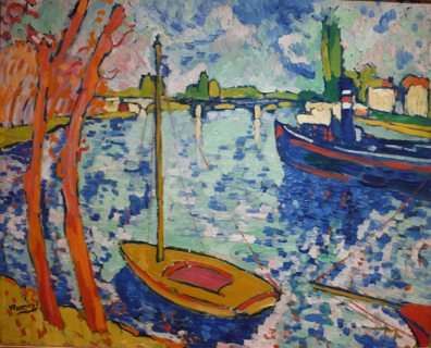
One of the great Fauve painters, Maurice de Vlaminck applied the same complementary strategy of juxtaposing complementary colors. He used expressive exaggerated gestures, simplified shapes and hard edges to define his objects. These hard edges interfered with a sensation of luminosity but, improved legibility which he found necessary because, he was so radically simplifying forms. We still see the bright blue reflection beneath the yellow boat just as we saw with Bonnard’s basket. We see orange verticals laid against the blue dashes of the field of water. Here is his 1911 painting.
Example 3
Painting at the same time as Vlaminck and young Bonnard was Edvard Munch, at end of the 19th and dawn of the 20th century. In Norway, with its long dark winters and long bright summers the color of twilight and evening was woven into the cultural vision. This example of Munch’s again shows the effect of the juxtaposition of blue/violet against yellow/orange. Where light is increased as in the illuminated windows, we perceive more yellow/orange and, as light is diminished we perceive more blue/green/violet. The contrast of the window light and the environmental light create a delicate and darkly luminous mood.
Example 4, Munch.

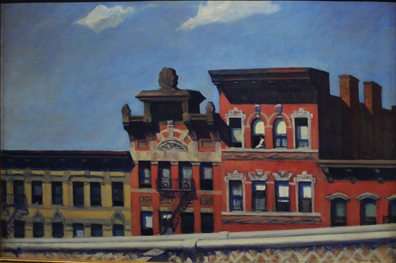
Edward Hopper, a great picture designer, aimed for a sense of the light within the painting. He too, did not just paint black or neutral gray shadows. He filled them with blue. The contrast of the blue sky against the red/orange buildings amplifies the feeling of light in the painting just as the blue paint he places in the shadows of the windows. When you look closely at the windows or shadow areas you can see that Hopper like Bonnard scraped or wiped paint away to reveal the light stubbly nubs of the weave of the canvas bubbling up through the paint color to give a feeling of secondary reflected light.
example 1, full painting.
example 2. detail of shadowed windows and other shadows.

I too find that borrowing ideas of successive contrast and simultaneous contrast(through complementary colors) I can reinforce the feeling of light and color in a painting. Orange abutting blue and, transparent red and yellow abutting blue. The contrast intensifies the sensation of color. The darker areas recede, the darker colors recede as a shadow does. The brighter colors advance. As Hans Hoffman would later say: the colors and their shapes act to push and pull against one another inside the picture plane.
Here are two high-keyed color paintings of mine illustrating these effects:
example 1. Oil on white enameled anodized aluminum.

example 2.oil on quadruple oil hand primed linen.

.
Fredric Neuwirth
What does ” Oil on quadruple oil hand primed linen” mean. I understand the primed part but what do the four parts have to do with it?
I like the example of complimentary colors and the fact that shadows are colors not just black..
I’ve passed your blog on to KevinDunn and we expressed interest in your comments.
I told him to comment.
Jeffrey Collins
Fredric, it just means it has 4 coats of primer on the linen. Which helps make it smoother and the idea that you see less of the weave of canvas. I have a friend that primes his canvases with acrylic gesso, then goes about applying many coats of acrylic modeling paste to smooth everything over so much that you NEVER see the weave of canvas. It’s just like a white slab of beautiful space. Ready for paint. It really helps make the paintings look even more amazing, as you don’t have that weave getting in the way of seeing.
Cheers
Fredric Neuwirth
jEFFREY,
MANY THANKS FOR THE EXPLANATION. I USE ACYRLIC VARNISH ON HOT PRESS WATER COLOR PAPER TO ENHANCE THE SURFACE FOR COLOR & BEING ABLE TO LIFT THE PAINT & GO TO WHITE.
jessica amos
Thanku :was looking for specifics on how luminosity created and reading this has been awesome – 3am now but will try it out tomoro morning! many thanx