
Black soot from fire became a first pigment for artists. Black outlines were strong and their effect was dramatic as we drew images or traced our hands on cave walls. Later Carbon blacks were used to dye clothing worn by nobility, merchants and bishops. Rembrandt had it as a part of his limited palette. Ancient Egyptians used it in their funerary portraits and makeup. Theophrastus of ancient Greece thought that all colors were composed out of black and white. Black has represented the dark side, chaos, the underworld and the demonic across time and cultures. We are diurnal and fear territory we cannot know like the dark. Black associates with infinite darkness, the void, nothingness. In many creation myths black came first then the light. We often associate white with purity. We discovered that black made from bones offered more translucence and gave more varied grays. A pale black mixed with a little white juxtaposed against browns and reds appears slightly blue. Black became the economic blue.
I have created a variety of woodland examples. Some use black acrylic, others graphite, others use chromatic grays which are so dark they appear blackish. In 17th century Italy black was a standard pigment on an artist’s palette. Artists made shadows and shades using black or mixing black with another color. They noticed the saturation of the color diminished when mixed with black. As Delacroix observed,” Black soils color.”
The first examples are historic artists who helped define our model for landscape painting. These three all used black. Claude Lorraine’s landscape ( example 1) presents the standard landscape model which he helped create. He often reverses the model. Here I have flipped his image to show you the model’s influence on landscape painters. The sides are framed with trees. The right side has the largest framing shape, a coulisse. There is a reflective body of light (water) taking a slight serpentine or meandering form in the lower middle. It interrupts the dark with light. Example 2 presents John Constable’s early 19th century version of a Claudian composition. Example 3 presents another modification of Claude’s model by the mid 19th century artist, Worthington Whittredge.
example 1. Claude Lorraine.
example 2. John Constable.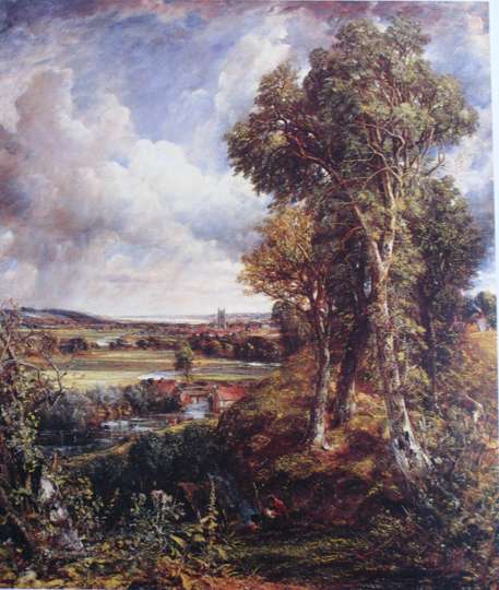
example 3. Worthington Whittredge.
They all used black on their palettes.
In my first examples (4,5, and 6) I present three plein studies in oil. None use black. All refer to compositional tradition of Claude but, with modifications. We modify the standard model to create an accessible experience with notes of novelty. The image is not too confusing to read because of my adherence to the model. We recognize the form and see a landscape possibility. The image is fresh and novel to the extent that I depart from the model.
example 4. oil on linen, plein air.
example 5, same scene, oil on anodized aluminum, plein air.
example 6. same scene but using a figure “8” design fitted into the composition, oil in plein air.
In my next examples I use different forms of black. The blacks are created from powered graphite and linseed oil, from standard ivory acrylic black, and a chromatic blacks made from ultramarine blue and transparent red oxide. All these examples also follow the Claudian model with personal variations. These examples use the same photographic source material which I manipulated in Photoshop then further mutated while painting.
Example 7 is the photograph I took this summer. Example 8 is the image re-envisioned with powered graphite on a 140 lb hot press watercolor paper. Example 9 presents the same composition with other modifications. The example on the left uses chromatic blacks mixed with acrylic Pthalo cyan, transparent red oxide, and ultramarine blue then a series of semi-opaque and translucent oil glazes were applied to give pale indications of color. The work was painted on brushed silver anodized aluminum. The example on the right uses black acrylic on white anodized aluminum. Example 10 presents a different Claudian adaptation with a mixed chromatic black following the same recipe as above. This image is painted on brushed gold anodized aluminum and can give the effect of an etched metal plate.
example 7. the photograph.
example 8. the powdered graphite drawing.
example 9. Left image on Brushed silver with oil glazes over acrylic; the right image is black acrylic on white anodized aluminum.
example 10. painting on brushed gold anodized aluminum.
In conclusion, I painted a 48×48 oil over a pre-existing image. I reveal parts of this original image in the final painting. The darks are made from ultramarine blue and transparent red oxide. Example 11 presents the pre-existing image. Example 12 is the manipulated photograph I took this summer which serves as the source for Example 13. Example 13 is the image as it appears now.
example 11. pre-existing image(substrate).
example 12. my photo source material, after Photoshop work.
example 13. my painting as it appears now.
Gail Ingis
Those green images remind me of a few summers ago at the road at Silvermine near the pond that a few of us painted. Your black details explanation is great.
Fredric Neuwirth
At a recent auction a John Constable sold for $5,200. The new buyer had it cleaned and certified by a Constable expert and it was re sold for $5,200,000.
Not bad return for ” Black Soot”!
Linda botwinick
Please advise where to get anodized aluminum an gold tone as well? It is difficult to find in south fl. Love your blog!! Very helpful
Ma. Aurora de Alban
Dear David, kindly continue with your articles. They are of great consequences to those who are impressed by it. I look forward to more readings. Thanks a lot, Ma. Aurora.
Elizabeth Merchant
Having a compositional form to work from with a landscape… allows the inclusion of major forms and the leaving out of excess… to create a strong image for the viewer to latch onto. Thank you for these explanations.