
If an artist or a magician wants us to look into the distance they direct our attention there. They exploit our sense of purpose or goal. Perception and recognition are determined by our goals. Goals are expectations. Our goals/expectations keep us from distracting information; information we don’t need. Children are more likely to see more of what’s around them because, they are more easily distracted by stimuli not related to their goal. Our goals mentally prime us to see and interpret what’s around us or, what’s in a picture.
Artists use conventions to set up an expectation in the viewer. We look past the threshold and borders of a painting into its distance. Our standard goal is to look into the distance for something. Because we look past whatever frames the distance we pay less attention to it especially, if its edges are undefined. Defined edges tell us something is present and, becomes our goal, our purpose for looking.
Landscape horizons traditionally offered a profile for hypothesizing. Is it a village?, a windmill? a series of mountains? Here are examples of artists exploiting our goal-centered adult vision. Example 1. is landscape from the 1600s by Jacob Van Ruisdael. We look at the edges of his horizon and the edges of trees to determine what is present. We tend to not look into the foliage, to not see it because, it is not the goal of our vision.
Example 2 is a detail within the Van Ruisdael painting. Notice how we look at the edges of dark against light. Van Ruisdael easily suggests foliage because we are not looking specifically at it. This experience is also true for the Pierre Valencienne’s oil sketch ( example 3). We look past the framing trees to the profile of a village on the horizon. We tend not to look within the foliage. These artists use the curtain of foliage as a device for texture, color, and a design element to frame the goal/ purpose of our looking.
example 1. Jacob van Ruisdael landscape.

example 2. detail of van Ruisdael landscape.

example 3. Valenciennes landscape sketch.

Similarly, Alfred Sisley frames his river landscape (the Seine) with a porous spray of paint suggesting foliage ( example 4). I borrowed the designs of these artists with their arching flora framing the picture in my following examples. My distance is smudged and uncertain. I suggest the idea of distant water with a few sputtering light-blue spots. I made my subject the texture and complexity of the interior grassy space with its abundant rhythms instead of a clearly profiled distance. In example 5 you see a photo I took walking along a lagoon this weekend in St. Louis’s Forest Park.
Example 6 presents an acrylic underpainting which places a dark warm neutral in the upper area and a light tone in the lower area of the picture. Example 7 ( step 1) shows you how I covered the underpainting by placing darks over the light bottom area and light over the dark top area. Example 8 (step 2) presents the effects of the squeegee’s action as it removed slivers of wet oil paint revealing lights in dark areas and darks in light areas. Area “A” has the light oil paint over the dark acrylic and area “B” has the dark oil over the light acrylic. Example 9 (step 3) offers a view of the painting as it appears now after some color additions.
example 4. Sisley’s landscape.

example 5. Forest Park Lagoon Grasses.

example 6. acrylic underpainting.

example 7. step 1, oil lay-in of darks and lights.
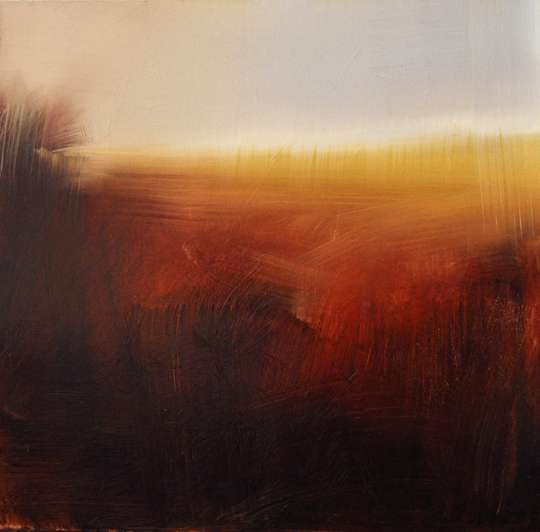
example 8.step 2, squeegee reveals.
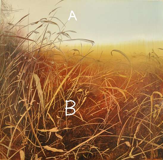
example 9.step 3, after more color.

I exploited the color and reflectance of copper in my next examples. I begin with an underpainting which only partially covers the copper in example 10 (step 1). Notice my image reflected in the copper here. In example 11 (step 2) I present an angled view of the painting to show how the reflectance of the copper varies with viewing angles. Example 12 (also step 2) demonstrates the full frontal view. Observe the differences in reflectance and color between the two views. Again my motif centers on looking through trees or flora.
example 10. step 1 underpainting on copper.

example 11. step 2. viewed at an angle.

example 12, step 2 again viewed from the front.

Margaret Sapir
I really enjoyed that voyage. Thank you.
LuzA
Excellent dissertation/demonstration really clear and interesting
Fredric Neuwirth
Turner, the movie. Mike Leigh will be at the Yale University Art Gallery to discuss the movie on June 18th. At yesterdays showing Ms. Gillian Forrester, Senior Curator of Prints & Drawings at the British Art Center gave a brief talk about Turner & answered some questions. I was disappointed in the movie. I was not expecting it to be a tutorial on how to paint like Turner but I did want to know something about the man, something that drove him toward light & his struggle to achieve it. Instead it was a movie about a curmudgeon who happened to paint pictures. Some info on Ruskin, but not about his endorsement and support. It is worth a look, the scenery is wonderful & beautifully photographed .
John Vukelic
Expectancy theory applied to the art of painting. Wow! Great article.
Connie Simmons
Sometimes I wonder what we really do see. Thank you for the interesting observations, as always. xox
Lesley Koenig
I’m new to reading your articles and what a great discovery! This blog and photos of demos are just as informative, entertaining and inspiring as the live lectures and demos. I’m so fortunate to live where you teach!
Jennifer Richard-Morrow
Another excellent essay on landscape.
I enjoyed the Turner film tremendously as a beautiful immersion into 19th century London. It made me want to find out more about Turner, so I am reading the biography by Anthony Bailey’s _Standing in the Sun, A Life of JMW Turner_. The film was inspiring; the book is more so.